Logos
Inspiration:
Sketches:
Artist Statement:
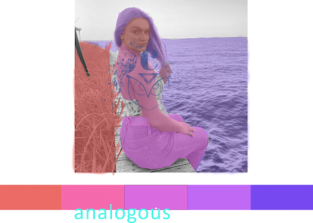
I did an owl since I feel like I have adapted to be an "night owl" since most of my classes are at night this semester back to back. Also I always thought owls were beautiful animals and are often overlooked. Its amazing they can spin their head 270 degrees and their feathers allow them to attack silently. I enjoyed this project because it allowed me to explore different colors and make different swatches. I also had fun using the gradient tool. It was kind of complicated to use but after practicing on other shapes besides my logo. I thought that the font I used for "C" was effective since it kind of matches the owls ears. I used the pen tool first then use the curvature tool to make it congruent.
Color and Black and white final:


I love the logo that you created. I first was a bit worried that it was gonna look like to owl from Duolingo. However, I think it can really match a lot of your work and I think it's very creative how you used C. I don't have really anything to critique, I picked this post because I remember seeing it and thinking it was one of the best ones.
ReplyDeleteI love how you connected this art to your personality. The colors and designs look amazing. I would say the yellow one is my favorite. Great work
ReplyDelete